Posted
Explained Using New ThreatConnect Dashboards
There’s no shortage of “dashboards” available in the software world. Walking the floor at any major industry event, it’s hard to miss the hordes of vendors touting their wares by showcasing line graphs, fancy animations, and (shudder) pie charts on big screen displays designed to shock and awe attendees into stopping by for scans in exchange for tchotchkes. But when it comes time to purchase from one of those vendors and you log in to their tool or platform, how often is the dashboard really your leaping-off point for your day-to-day? How much use do you get out of them on a daily basis? What’s the point of a “bright and shiny” dashboard if all the bright and shiny does is make your eyes glaze over?

Dashboards should not be an impenetrable fog of complication.
Perhaps the reason dashboards aren’t as captivating or useful as they could be is that too many of them just don’t help users answer tough, key questions.
In our latest release, ThreatConnect introduces a brand new dashboard feature. In this blog post, I’ll walk you through some of the built-in dashboard charts and use them to illustrate some best practices that you can employ when creating your own dashboards. That way, you can be sure your new ThreatConnect dashboards will help you answer tough, key questions about threat intelligence and your organization’s security.
What Makes a Good Dashboard?
A good dashboard should provide at-a-glance monitoring of the information you need to make key decisions. Think about your car dashboard for a moment: it shows speed so you know to slow down or go faster, fuel levels so you know when to make a pit stop, and warning lights to show if there’s a problem. These are key indicators that help drive decisions. Your car dashboard does not display a pie chart of how many times you’ve made left- and right-hand turns, counters for how blinky your turn signals are, or a rotating pew-pew map of where other cars are honking their horns at each other. These things don’t make you a better driver.
Your ThreatConnect Dashboard should be like a car dashboard: it should help you make at-a-glance decisions. To that end, your dashboard should be, or show:
- Comparative – Dashboards should help put things in context so you can compare data against one another.
- Understandable – Your dashboards should be easy to follow and the information on them should be meaningful.
- Ratio or Rate – Ideally, you should have some idea of change over time. There’s a reason the biggest number on your dashboard is “Miles per Hour” and not “Miles Driven” or “Hour Driven.”
- Behavior Changing – Probably the most important one. Dashboards should provide information that helps drive the behavior of your security team.
I like to remember this using the acronym “C.U.R.B.” Now let’s go in-depth on each of these items, using examples from ThreatConnect.
Comparative
A guy walks into his therapist’s office. Therapist says, “so, how’s the family?” The guy says, “Compared to what?“
Good joke, right? It brings to mind the first part of CURB: Comparative. We deal with a lot of numbers and bits of information in cybersecurity, so it’s important to understand how those metrics compare to others. For example, if I told you that your team tracked ten incidents last month, what would you do with that information? Is that a lot? A little? But what if I told you that your team had ten incidents last month, but zero in the two months prior. Now you have some context for that number, and can consider taking action.
Let’s take a look at a noncomparative and comparative example in ThreatConnect.
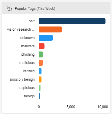
A chart of popular tags from this week.
In the above dashboard card¹, we’ve created a Query-based chart. These charts use TQL (ThreatConnect Query Language) to query and aggregate information. This particular card shows the most popular tags used on indicators that were added to ThreatConnect in the past week. You can duplicate this card yourself using the following query: dateAdded >= “NOW() – 7 DAYS”.
Don’t get me wrong, it’s not a bad card. Especially because I can click on any of these tags and see the associated indicators and intelligence. But consider how much more useful it would be if we compared “this week” to “last week”:
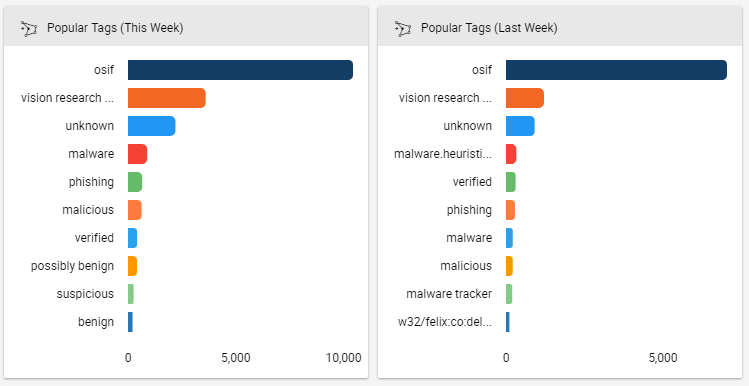
Comparing this week against last week helps us identify trends and patterns.
Now we can see that these tags change week to week. Malware trackers have fallen off and instead we see a bucket of possibly benign indicators. Where’d they come from? Are we in danger of spending time on some false positives? Was that Felix malware ever resolved?
By comparing these two cards against each other, we start telling a story and can begin deciding how to take action. The “Last Week” card was created using the query: dateAdded >= “NOW() – 14 DAYS” and dateAdded < “NOW() – 7 DAYS”. Note that both cards are shown side-by-side on the pre-built “Operations Dashboard” available in our Cloud environment.
Understandable
Take a look at the space shuttle cockpit photo from the beginning of this article. If your car looked like that, how quickly do you think you’d be able to react? The same is true in cybersecurity: we can’t react to our data and intelligence if we can’t understand it! The same is also true for the specific metrics we use; there’s a reason your car shows “Miles per Hour” and not “Leagues per Microfortnight.”
________________________
¹A “card” is the basic building block of a dashboard. Cards can be charts (bar, line, treemap, etc.), datatables, or functional widgets like a search bar.
Let’s say you wanted to monitor the most popular tags in one or more sources and communities either for all time or for a specific date range. This is a good way of identifying interesting topics, especially when looking into a new source of intelligence.
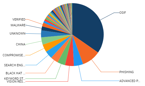
How can you see what’s going on in this hard-to-understand chart?
I dream of a world where terrible charts are anomalies.
The pie chart above is certainly one way to do it. But why display it that way? Most tags are too small to appear, and it’s very hard to tell how big each of the tags are. Plus, many of the tags are too small to fit!
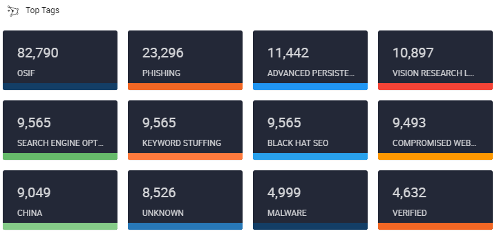
Fewer tags and a different layout makes for a much more understandable chart.
All we need for our decision, “does this source contain intel that’s interesting to me?”, is a simple grid that clearly shows the available tags and how many there are of each. An added bonus is that you can click on any of these tags much more easily than you could on the pie chart to actually view the associated indicators and intelligence. Note that this card (not the inveigling pie chart) is available on the built-in “My Dashboard” in our Cloud environment.
Ratio or Rate
This is probably the least critical of the four parts of CURB, but only because it doesn’t apply to every dashboard card and metric like the others do. But, it does have its place! Using a ratio or rate makes it much easier to understand what’s happening at a particular moment in time. The biggest number on your car dashboard is a rate (miles per hour) because as a driver you need to know how fast you’re going now – just showing miles driven or hours driven won’t tell you that and won’t help you make a decision around whether to speed up or slow down.

What the heck happened with those two spikes in the right-hand chart? Better investigate!
In the example on the left, we show a cumulative count of Observations and False Positives over the past month. And basically we can see that… it goes up, which is what we’d expect since all we’re doing is summing numbers! It tells a nice story, but not one from which we can really make decisions. Compare that to the example on the right where we take the exact same data but look at it per day. A pattern emerges; one that is worthy of additional investigation.
The card on the right is available on our built-in “Source Analysis” dashboard in our Cloud environment.
Behavior-Changing
Of all the parts of CURB, this one is probably the most important. The point of a dashboard is to help us make decisions, so the information we present in the dashboard must be behavior-changing. A big reason fancy dashboards fall short is because they offer “pretty pictures” but not behavior-changing information. Going back to the car example, if your dashboard says you’re going 55 miles per hour on the highway and I ask you what you would do if your dashboard said 25 miles per hour, you know exactly how your behavior would change based on that information: you’d speed up!
Compare that to a metric that didn’t change behavior. If you had a dashboard that said you had a million indicators, and I asked what you would do if the same dashboard told you that you had a million and a half indicators, what would you do? How would your behavior change? It probably wouldn’t change at all: it’s not a behavior-changing metric!
So I propose a litmus test when using a dashboard: if the information you’re seeing changed, what would you do differently? If the answer is “I don’t know” or “probably nothing,” you should consider whether you’re getting value out of that dashboard.
Let’s say you manage a security team. Your goal is to try and make your team more proactive by identifying and blocking adversary assets directly rather than responding exclusively to active campaigns. To facilitate this, you’ve configured a Playbook that allows your team to block indicators that have been associated to specific pieces of intelligence like Incidents, Campaigns, and Adversaries. For your dashboard, you want to track how many indicators are being deployed based on the type of intelligence to see if your team is addressing the problem.
First, configure custom metrics to track the average monthly deployments to your defensive devices by the type of Group (Incident, Adversary, etc.), versus the indicator deployments your team has done in the current month.
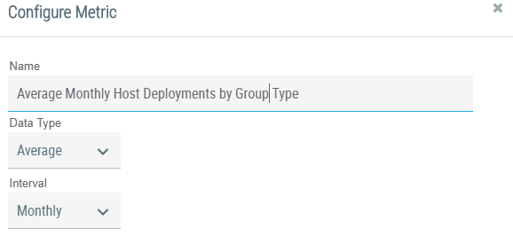
ThreatConnect lets you create custom metrics to add to your dashboard. Note the “Interval” dropdown to help ensure you’re using a ratio or rate.
Next, add the metrics to the Playbook that your team uses to deploy indicators to your defensive devices.
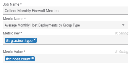
These metrics can be used outside of charting to drive logic and make your Playbooks smarter.
Now, every time your team uses this Playbook to deploy indicators, your dashboard will be populated with these metrics.
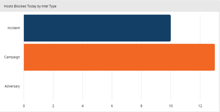
Average monthly host deployments on average by intelligence type.
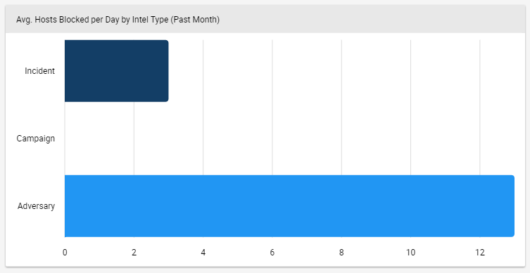
Host deployments in the current month by intelligence type.
By putting those two charts on your dashboard, you can see that the initiative to have your team take more proactive action appears to be working (they’re blocking Adversary assets instead of just reacting). And now we come full circle to the behavior-changing aspect. If the bottom card showed that your team was still taking most of their blocking actions on Incidents and Campaigns, you’d know to course-correct the initiative. This dashboard works because you’ve selected metrics that will drive decisions around a specific goal. Congratulations!
Learn More
Now that you understand how to create dashboards that are Comparative, Understandable, use Rates, and are Behavior Changing, I hope you’ll take ThreatConnect’s new dashboard feature for a spin and try to make CURB-y dashboards for yourself! This post barely scratches the surface of ThreatConnect Dashboards. Learn more about dashboards, here. For a full copy of the release notes so you can see everything that’s included in our latest release and our new TAXII server, please contact sales@threatconnect.com. For product feedback, please contact me directly at dcole@threatconnect.com.

